Sunday, December 4, 2011

Favortie Logo (Entree #23)

This was my favorite logo because I LOVE the simplicity, creative lettering, and the message it indirectly relays by taking out the "a" in backspace! What a creative logo- I think it accomplishes exactly what a logo should by using as little wording as possible to communicate a big message!

Lines that convey Emotion (Entree #22)

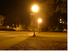
One of the most powerful feature of the use of lines is it's ability to suggest emotion! Below are three photographs that include lines and set a certain emotion in the way they are used!

This bench has all vertical lines, except for the iron supporting structure which is more curvy lines. The emotion I received from these lines is a neutral, calming emotion. The lines are very organized, giving a neutral, structured feel.

This photograph of railraod tracks gives a nervous, excited feeling. Perhaps it's the linear perspective that the photograph was taken that contributes to this nervous feeling, which is once again another line besides the vertical and horizontal lines we see in the tracks.The lines also convey the feeling of adventure and mystery as your eye is drawn to the unknown horizen.

The blue slides on this playground reflects a more creative, wavy line. This line conveys a more playful, happy feeling of childlike simplicity.  

Thursday, December 1, 2011

Types of Lines (Entree #21)

The two types of lines I chose to focus on are Implied Lines and Psychic Lines! 
I chose to pick two examples from Mercer to demonstrate these two types of line!
~An implied line is created by positioning a series of points so that the eye tends automatically to connect them..
In this picture of Mercer's lamps, you atomatically connect the two lamps to make a line.

~Psychic line is where there is no real line yet we feel a line.
In this picture of me and my friend Betsy, there is no line, but your eyes immediately create a line from my face to hers since we are looking at each other Ithis picture is at Mercer when we were gathered at a sorority event)!

Sunday, November 13, 2011

Logo (Entree #20)

            I picked the Ralph Lauren logo because it is simple while     remaining interesting. The horse and rider are a classic and timeless image. Alhtough this image includes the Ralph Lauren name, the horse and rider image would be easily associated with Polo (without any text) by the
                                          majority today.

Thursday, November 10, 2011

Mercer's Global Health Program (Entree #19)

                                                 
                                           International Travel!

                                                            
                                                      Service!


                                             Changing the world!


Public Health


Community
These are all words and images that made me think of Mercer's Global Health Program's mission. I think the program has a great goal to physically help communities around the world who desperately need the medical knowledge Mercer possesses!

Wednesday, October 26, 2011

Art made from Money (Entree #16)

I absolutely loved these art pieces because of their great detail and realistic appearance. The city view is such a cool idea and very well done in these two pieces!

Tuesday, October 18, 2011

Fundred (Entree #14)

I picked this fundred because I love love LOVE kittys! How can you not smile when looking at this?

Saturday, October 15, 2011

Money (Entree #13)

I chose New Zealand's paper currency because I liked the use of color and design. One of my favorite parts of the currency is the queen's picture, which is the central focus. I also like the overall design because of how different it is than the U.S.'s currency. The color, picture, and design are a vivid contrast in comparison to the currency I see everyday!

Grids (Entree #12)

       The windows in the University Center are a great example of a loose grid pattern!
My calculator is a great example of a tight grid pattern because of the compact keyboard!

Saturday, October 8, 2011

Chuck Close (Entree #11)

I chose this particular image by Chuck Close because of it's incredible detail and originality. Close's work creates an abstract image that collectively makes a human face. I love the color detail he uses in this creation and the way the piece looks less like a human the closer it is observed. The colors and the way the image forms a circlular shape gives the face depth and a very realistic aspect.

Tuesday, September 27, 2011

Repetition of Form (Entree #10)

I chose this piece of commercial art because it conveys repetition of form in a very straight-forward way. The photographs are all different, but they are repeated and arranged together to form a unified collage. I really like the way each picture is unique, but at first glance their is still unity in the entire piece. The repetition of form in this work is very attractive to the eye and easily keeps the observers attention by looking from photograph to photograph.

Andy Goldsworthy (Entree #9)

I picked this particular image to refect Andy Goldsworthy's work, but it was very difficult to pick just one image! All of Goldsworthy's work is so interesting and appealing to the eye! I love his use of circles and the way he captures nature in a way that is especially facinating. This particular pictrue drew my attention to the circles and the mystic like scene that he portrays.

Tuesday, September 20, 2011

Gestalt Principles (Entree #8)

http://sensingarchitecture.sensingarchitect.netdna-cdn.com/wp-content/uploads/2009/04/gestalt-pattern-image.jpg

The image I found illustrates Gestalt's principle of visual perception. The pop of color among similarity draws the eye to one particular point in the image. Gestalt's use of shape and color are two very important aspects that affect the visual perception of the subject toward the image.

Friday, September 16, 2011

Form vs Content (Entree #7)

http://dowjonesstockinvesting.com/wp-content/uploads/2010/07/Mcdonalds.jpg

When taking content and form into consideration, the McDonald's symbol is a great example of creatively and successfully harmonizing both. Although the form is extremely simple, it is well known by not only American culture, but worldwide. The designers took this simple form of an "M" and used it to successfully communicate it's content around the globe.

Wednesday, September 14, 2011

Vending Machine: Joseph Cornell (Entree #6)

I picked a vending machine as my object because it reminds me a lot of a Joseph Cornell box. Just like Cornell's works, the vending machine holds lots of objects and has a protective glass covering. Although the vending machine is a common day example, it represents the basic structure that Cornell used in many of his works. 

Friday, September 9, 2011

Lucas Samaras (Entree #5)

http://cs.nga.gov.au/IMAGES/LRG/32436.JPG

Lucas Samara's "Box no. 85" was very appealing to me as it took a simple box and transformed it into a more complex piece. Samara's box is very textured, using a vast array of colors on the outside. The box being opened conveys a sense of progression or narrative, an opening of new ideas, and discovery! Unlike Joseph Cornell's boxes filled and overlapped with different objects, Samara's box is simple with less chaos and clutter. Although more simple to look at, Samara's box is still very applealing to the eye because of his use of texture and color.

Louise Nevelson (Entree #4)

http://artforceone.files.wordpress.com/2010/09/dsc_0911.jpg
Louise Nevelson's "Black Wall" is a three dimensional sculpture made out of metal and painted wood. The sculpture is made of numerous small boxes containing pieces of a machine. This particular piece caught my eye because of it's bold shapes and sharp, distinct cuts. Although "Black Wall" is filled with diversity, all of the different elements flow together in unity. Although Nevelson's use of boxes is very different than Joseph Cornell's work, both artists use boxes to design unique pieces that communicate a specific message.

Monday, September 5, 2011

Joseph Cornell (Entree #3)

http://elseachelsea.typepad.com/frolic/images/2007/07/16/josephcornell2.jpg/

The piece of artwork I chose is called "Setting for a Fairytale" by Joseph Cornell. This particular piece is interesting to me because it is an old a mansion or castle that has many aspects of design, yet it also possesses a real simplicity that makes it look like a building that really could exist. I love the design and structure of old buildings and this one is very whimsical! This piece of work really speaks to the hopeless romantics like myself!

Design (Entree #2)

If I were to define design in my own words I would say that it means to create or execute in an artistic or highly skilled manner.

http://cooldesktopbackgroundsx.com/wp-content/uploads/2010/06/Design.jpg

I really thought this image displayed many aspects of the word design in it's creativity and unique characteristics!

Monday, August 29, 2011

Types of design (Entree #1)

One common type of design is visual solution. In this type of design how the letters are arranged is an essential part of communicating the idea. Visual solution is often seen in advertisements as the marketing industry uses this design strategy to appeal to their audience. Chick-fil-a's logo is a great example of visual solution!
http://habititus.files.wordpress.com/2011/02/chick-fil-a-logo2.png

Form and content, is an essential design process that explains what will be presented and how it will be presented. Defining the relationship of form and content is a critical part of the thinking stage of the design process. One example of content being clearly communicated by the appropriate image or form is the Jaguar logo.
http://hicars.org/wp-content/uploads/2009/07/Jaguar-Logo.jpg

Icons or pictograms are forms a designer creates to bring simplicity and clarity in communicating an idea. Icons communicate an idea using shapes and pictures instead of words. Although icons provide simplicity, there can be some confusion since sspecific symbols may lose meaning when they cross national, ethnic, or religious borders. The icon for a public restroom is an excellent example of this element of design!
http://www.morrisonsign.com/images/large/is4.jpg